Generic filters
Exact matches only
APP REVIEW

‘Zenkit To Do’s’ redesign is a big mistake

The Wunderlist Replacement That Missed the Mark
zenkit logo wrong

Zenkit To Do has long been a favourite among users who appreciate simplicity and functionality in a task management app. As a user who migrated to Zenkit To Do after the unfortunate closure of Wunderlist, I found solace in its clean, spaced-out design that was not only aesthetically pleasing but also user-friendly. For individuals like myself and others with a preference for order and structure—especially those with OCD—the app’s customisable themes and intuitive layout were a breath of fresh air.

Once the Gold Standard in Task Management Simplicity

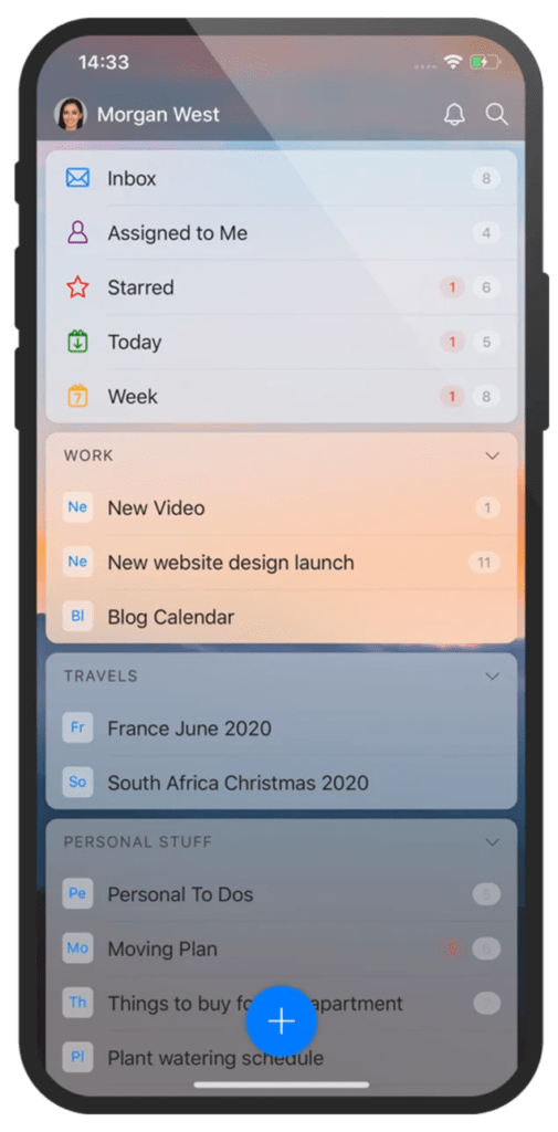
For years, Zenkit To Do has been a shining example of what a task management app should be—clean, functional, and beautifully designed. The app was a haven for users who appreciated its simplicity and elegance. With its innovative design elements like ‘Glassmorphism’ and Bento box layouts, it was ahead of its time.

Simplicity Was Its Strength

The appeal of Zenkit To Do lay in its simplicity. It did not try to overwhelm with unnecessary features but focused on what it did best: creating lists and helping users keep track of their tasks. It was an app that just worked, and it worked beautifully. For over four years, I, along with many others, enjoyed the minimalistic design that allowed us to organise our lives with ease. The lack of constant, unnecessary changes was, in fact, one of its greatest strengths—if it’s not broken, don’t fix it.

review2


A Design Update Gone Wrong

However, with the latest update, Zenkit To Do has drastically altered its design, and unfortunately, it’s a change for the worse. The once clean and organised interface now feels cluttered and broken. The carefully considered spacing that made the app so accessible and easy to navigate has been compromised. The new design feels rushed and poorly thought out, leading many loyal users, including myself, to uninstall the app after years of dedicated use.

Users Disappointed and Frustrated

The backlash has been significant. The very community that once sang praises of Zenkit To Do is now voicing their disappointment and frustration. Many users, especially those who valued the app’s previous design for its clarity and calmness, are left feeling betrayed. The update feels like a complete disregard for the user base that Zenkit To Do had cultivated over the years.

Searching for a New Task Management Tool

For many, this latest update is the final straw. After spending months searching for the perfect replacement when Wunderlist closed down, I eventually found Zenkit To Do. It wasn’t just me; I introduced it to about 15 other users, all of whom fell in love with the app as it was. But now, I find myself once again on the hunt for a new task management tool, as the app I once relied on has, in my view, been ruined by these ill-conceived changes.

OLD VERSION

zenkit old design

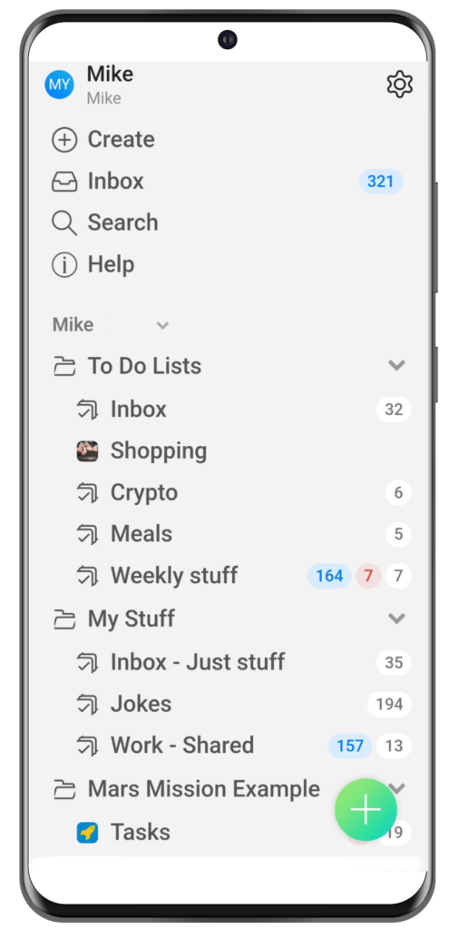
NEW VERSION

zenkit new

The drag-and-drop functionality, which recently included a simple but effective update allowing users to angle list items being dragged, made organizing tasks a joy. Users, particularly those with OCD, loved the customisable themes and clear, spaced-out interface that allowed them to focus without distractions.

However, the recent design update to Zenkit To Do has left many of us—longtime users—disappointed and frustrated. The app, which once felt like a breath of fresh air, now feels cluttered, disjointed, and broken.

A Tale of Two Designs

When comparing the old design to the new, the differences are glaring. The previous design (as seen in the first image) embraced a visually appealing approach with rounded edges, clear sections, and a thoughtful colour palette that made navigation intuitive. In contrast, the new design (second image) feels sterile and uninspired.

Design Issues:

  1. No Colour: The new design strips away the colourful, vibrant elements that made Zenkit To Do easy to navigate. Without these, the interface feels flat and it’s harder to distinguish between different sections or tasks at a glance.
  2. No Padding: The lack of adequate padding means that the interface feels cramped. This not only makes it visually unappealing but also leads to frequent misclicks. Users are now accidentally selecting the wrong tasks or lists, which is both frustrating and counter productive.
  3. Misplaced Icons and Images: The shopping list entry, for instance, now features a tiny, almost illegible image, as I have an image in that list. This design choice feels out of place and distracts the user without adding any real value. It’s a far cry from the cohesive, polished look of the previous version.

Unnecessary Clutter:

The new design also introduces a series of unnecessary elements that clutter the interface:

  1. Help Section: There’s now a dedicated “Help” section that sits prominently on the main screen. This is baffling—how often does one need help? This should be tucked away in the settings menu, accessed via the cog icon, not taking up valuable screen real estate.
  2. Search Bar: Instead of a simple icon at the top, “Search” now occupies a full line with text. It’s redundant, as most users intuitively know to look for a search icon at the top of the screen.
  3. Redundant Create Buttons: The “Create” function is not only given its own line but is also repeated with a large screen icon at the bottom. This kind of duplication is unnecessary and goes against the principles of a clean, minimalist design. Moreover, the account holder’s name is displayed twice, no sorry three times, adding to the unnecessary repetition and clutter.
  4. Increased Inbox Notifications: In the new version, my inbox has ballooned to 321 items, all of which are repeated reminders that clutter the list. This isn’t helpful—it’s overwhelming. This increase in notifications only adds to the sense of chaos in the new design.

A Better Approach to Design Updates

The most frustrating part of this update is that it could have been handled so much better. Look at what companies like Yahoo have done in recent years:

  1. Introduce New Themes Gradually: A welcome splash screen could have introduced users to the new design, giving them a choice to try it out or stick with the old version.
  2. Offer a Revert Option: Always leave a button in the settings area to revert to the previous design if users prefer it. This respects long-time users who may not appreciate sudden changes.

From a coding perspective, this approach isn’t complicated. The design should be separated from the data, allowing the app to check if the user has opted into the new design theme and load it accordingly. If not, the app should simply load the legacy theme. It’s a simple solution that could have saved Zenkit To Do from alienating its loyal user base.

Latest Google Play Reviews

Have a look at the latest reviews here, or add/update your own. – https://play.google.com/store/apps/details?id=com.zenkit.todo

zenkit review
zenkit review3

Voice Your Opinion

It’s true that you can’t please everyone all of the time, but the current Zenkit To Do update feels like it’s pleasing no one. As users, it’s important to voice our dissatisfaction with this forced change. I’ve already removed my 5-star review from the Play Store and voiced my concerns, only to receive a generic response:

“Thank you for the honest feedback! We understand that the new version takes some getting used to. Feel free to contact our support team via [email protected] with any further questions or suggestions for improvement. Cheers, Louisa”

Getting used too! Really…
This kind of response feels like a brush-off, an indication that the company may not be truly listening to its users. I encourage everyone who feels similarly to make their voices heard. Email them at [email protected] and let them know how unhappy you are with this design.

Final Thoughts

Zenkit To Do was a brilliant app—one that I recommended to at least 15 other people who also came to love it for its simplicity and elegance. But with this latest update, it feels like the soul of the app has been lost. For now, it’s time to start the search for another app, as Zenkit To Do, in its current state, is a shadow of its former self.

It’s sad to see Zenkit To Do end this way, but all good things must come to an end. So, while it was great while it lasted, it’s time to bid farewell. You were once a beacon of simplicity and effectiveness, but now, you’re just another app lost to poor design choices.

RIP Zenkit To Do - You will be missed.